InfoCommons #3 – Apps for Sharing Community Data

In all the craziness of transitioning from my job at the United Way to Google, I neglected to post my last AIRS newsletter column…and I’m just realizing it now, 4 months later.  Eh, life!  So here it is, for posterity.

– – – Published April 2013 in the AIRS Newsletter– – –

Sharing data about community needs is one of the many important functions of information and referral services, but it’s often one of our biggest challenges. We have multiple stakeholders of various types who may want data presented to them through very different lenses. We have data that needs to remain confidential, and data that can be shared in aggregate form to provide crucial insight into how needs are changing among the populations we serve. We may be asked to respond to last-minute requests for information about social services in a specific geographic area, or summarize the needs of a certain population.

The variety of data requests to which I&Rs are asked to respond can become overwhelming. While most software systems provide tools to help us in this area, you may still have some reporting needs that aren’t being met. Can you provide your key partners with anonymous data about calls that they can access via a web browser on a weekly basis? Can you provide interactive charts and graphs that allow stakeholders to see, at a glance, the breakdown of caller needs? Can you quickly generate a map of where calls for a certain topic originated during the past 3 months? Does your data team feel overwhelmed by the need to generate unique reports for everyone who asks? Do you have multiple people pulling data from your system and coming up with different numbers for the same questions?

While no one tool can address all these complex challenges, here are two free online apps that may be able to help:

Google Fusion Tables

Google offers Fusion Tables, a free experimental tool that you can use to upload data from a spreadsheet and quickly create interactive charts and graphs. When users mouseover part of a pie chart, for example, the number of calls and need category will pop up. You can also create summary tables, maps, and “card” views of your data, which turns each row of a spreadsheet into an easily readable index-size card displaying the contents of each field. graph1
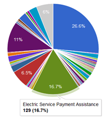
Perhaps the best part of this tool is the ability to create views of your data that can then be shared with others, either via a link or by providing access to specific users through their Gmail accounts. This feature allows you to share only certain fields of a spreadsheet while keeping others visible to just you. When users access a view, they can create new charts and filter the data to display what’s relevant to them without changing the layout of the original Fusion Table. This type of functionality makes data sharing much more efficient; instead of creating reports for each county in a region, for example, you can simply upload your region-wide (anonymized) call data and give your regional partners access to filter the data by county or by whatever criteria are relevant to them. Google Fusion Tables also offers a mapping feature, but for that I prefer another tool:

GeoCommons

GeoCommons is a free online mapping application that enables you to upload a spreadsheet, geocode the data, and display it on an interactive map. Since GeoCommons is also a place for sharing datasets, there are many types of data that you can layer onto your call data to add meaning. Examples of datasets that are freely available and have been uploaded to GeoCommons are: school districts, foreclosure scores, unemployment rates, census demographics, bicycle counts, legislative districts, adult ESL & GED information, profiles of older adults by state, and much more. The benefit of GeoCommons is the huge variety of datasets that have been uploaded, but this can also be a drawback because some of them are not formatted properly or may not look right when superimposed on your call data. You may have to experiment with multiple versions of the same data to find a set that works best with your map.map1

Despite the need for some tinkering to create a good map, the visual impact of the final product cannot be overstated. You can instantly see which areas in your region are generating the most calls for a specific need, and if you layer other datasets over your data, you can simultaneously display meaningful information like income level and foreclosure rates for the regions that generate high call volume. GeoCommons maps can be embedded in webpages and shared via links just like Google Fusion Table charts.

These are only a couple of the many free online tools just waiting to be discovered. The more you explore, the likelier you are to find a tool that could end up providing an ideal solution for your data-sharing needs!

InfoCommons #2 – Usability and Online Forms

My second InfoCommons column was published this February in the AIRS Newsletter.

Forms are ubiquitous in the world of information and referral.  Many of us use online intake forms embedded in software to record calls; we use online search forms in resource databases, and we provide forms for users and agencies to contact us. Poorly designed forms can cause confusion for users and result in bad information being entered.   If users don’t understand why they’re being asked for certain information, they may simply refuse to provide the information.  In their book Forms That Work, Caroline Jarrett and Gerry Gaffney propose that forms involve three layers:

  • The relationship of a form is the relationship between the organization that is asking the questions and the person that is answering.
  • The conversation of a form comes from the questions that it asks, any other instructions, and the way the form is arranged into topics.
  • The appearance of a form is the way it looks: the arrangement of text, input areas such as fields and graphics, and the use of color. (Jarrett & Gaffney, 2009)

The user experience involved in each of these three layers has implications for the success of a form.

Relationship and Conversation

It can be challenging to organize the flow of an intake form to promote accurate collection of information while facilitating natural dialogue between an I&R Specialist and a caller.  One common problem with online forms is that questions may seem random if each new piece of information doesn’t relate to what’s previously been requested. When an I&R Specialist is acting as an intermediary between a caller and an intake form, it’s easy to explain why certain information is being requested – there’s a more personal relationship and conversation happening. In a purely web-based setting, it becomes crucial to gain users’ trust by clearly indicating who we are, why we’re requesting certain information, and how that information relates to what the user has already entered.  Jarrett and Gaffney provide this advice: “It’s usually best to ask anticipated questions before you move into something unexpected or unusual. Ease into questions that may intrude on the user’s privacy by dealing with neutral topics first.”

Image
Example form field with explanation for why information is being requested.

The relationship between your organization and the users of your online forms may be relatively clear, but it always helps to make sure that your public online forms are clearly labeled with your logo, and provide reassurance to the user about how their information will be used and where it will be sent.

Appearance

The appearance of forms is often the area over which we have the least control when using software, content management systems, or online services like Google Forms or Formstack.  Many form-creation services don’t allow customization of field label displays, dimensions of input boxes, typography, or grouping and placement of fields. However, if you have control over the appearance of your online forms, I encourage you to consider how you can manipulate these elements to promote usability:

  • Results from user testing of forms, including eye-tracking studies, indicate that users see labels above and to the left of fields. Putting labels above fields reduces the eye movement required to scan the labels and fields, but can result in the form appearing longer.
  • Reading right-aligned text is harder than reading left-aligned text, especially if your question runs over more than one line. For simple, often requested data, right-aligned field labels will enable users to move swiftly through a group of fields. However, if you form asks unfamiliar questions that requires people to scan labels to learn what’s required, left-aligned labels work best.
  • Make your forms more organized by grouping related fields together.  You can do this using placement, spacing, alignment, and background color.

Users with different experience levels and motivations will interact with web forms differently. By providing well-organized and easy-to-use forms for the public and for I&R Specialists, we’ll be more likely to succeed in collecting the information we need.

Further reading:

Friedman, V. (2008, July 4). Smashing Magazine. “Web Form Design Patterns: Sign-Up Forms.” http://uxdesign.smashingmagazine.com/2008/07/04/web-form-design-patterns-sign-up-forms/

Jarrett, C. & Gaffney, G. (2009). Forms that Work: Designing Web Forms for Usability. Burlington, MA: Morgan Kaufmann Publishers.

Penzo, M.  (2006, January 23)  UXMatters.  “Evaluating the Usability of Search Forms Using Eyetracking: A Practical Approach.” http://www.uxmatters.com/mt/archives/2006/01/evaluating-the-usability-of-search-forms-using-eyetracking-a-practical-approach.php

InfoCommons, Episode 1

My very first column debuts this month in the AIRS Newsletter. Thanks to AIRS for letting me share my thoughts about technology and the world of I&R!

Introducing InfoCommons: The Column & The Concept
By Tricia Burmeister
Usability and Data Manager, PA 2-1-1 Southwest United Way of Allegheny County
Editor’s Note: This month we welcome Tricia Burmeister and the new InfoCommons feature that replaces the former User-Friendly column.

This new column in the AIRS newsletter is inspired by the concept of the “information commons” – an interactive space where people can share knowledge and resources. In the coming year, I will be sharing my thoughts on how I&Rs can use technology to facilitate collaboration and communication amongst ourselves and in our communities. The term “information commons” has become trendy in recent years, but what does it really mean? The World Wide Web is one giant information commons, with some sites like Wikipedia and the Internet Archive embodying the concept especially well. Many libraries have begun to use the term to describe physical spaces where users can collaborate and access online resources. Investigating the idea of the
information commons can provide an interesting perspective on how I&Rs interact with one another and with those we serve.
A 2008 article in the Annual Review of Information Science and Technology outlined the following characteristics of information commons:
•they benefit from participation: the greater the participation, the more valuable the resource
•they take advantage of the Internet to build information communities
•they are often free or low cost
•they are interactive, encouraging discourse and exchange among their members
•their participants often contribute new creations after they gain and benefit from access (1)

Each of these criteria can be applied to I&R services in some way. By serving as a one-stop resource for social services information, I&Rs function as information hubs for our communities. Our resource databases are valuable stores of knowledge about services, while the data we collect about those we serve provides a crucial perspective on community needs. When agencies
participate in the maintenance of information in an I&R database, everyone benefits from the improved quality of the resource. By providing searchable online databases and using our websites to guide people to services, I&Rs are taking advantage of the Internet, but are we doing as much as we can to build “information communities”, online or otherwise? How do we encourage
discourse between ourselves, service providers, and the people we serve?

There’s an important exchange of information that happens when we follow-up with callers to find out if they received services. Caller satisfaction surveys  provide feedback on how we’re doing, as does the number of people who contact us again after reaching out for help the first time. Follow-up plays a
role in the exchange of resource information when callers provide feedback about the help they received and their experiences accessing services. When inquirers receive information or referrals from you, do you provide easy
ways for them to contribute something back to the system, whether it be
positive feedback, complaints, success stories, or updated information about
services for your resource staff to investigate? How can we connect those in need of services with the help they need, but also encourage them to share
information with us – to engage in more of a discourse instead of information
flowing one direction? How do you capture feedback from callers so you can synthesize it and draw meaningful conclusions?

Similar questions apply to the interactions between I&Rs and service providers. Many resource databases offer comment features that allow anyone to submit feedback about the information in our records. There is always conversation going on between I&Rs and service providers to ensure that appropriate referrals are being made. Nevertheless, I’m sure many resource managers wish for higher levels of participation from agencies in keeping their information up to date. Generating interest doesn’t seem nearly as difficult as sustaining engagement over time, when, despite your gentle reminders, that agency still hasn’t reviewed their information. What methods do you use to encourage feedback from service providers? Are there ways that you use caller feedback to provide a sense of urgency that prompts an agency to update their
information?

The model of Wikipedia – the quintessential information commons – is difficult to apply to I&R because many people in need don’t want that fact to become public. This eliminates the motivation to contribute information in a public  forum where it  could benefit everyone. One of the values of I&R is that we can serve as more personalized, confidential Wikipedias for social services, comparing caller feedback with the information provided to us by agencies. By balancing these two information channels and promoting the flow of information, we provide a valuable shared resource and serve as information commons for our communities.

(1) Kranich, N., & Schement, J.R. (2008). Information Commons. In Annual
Review of Information Science and Technology (ARIST), 42, 547-­‐590.