My first ArcGIS Instant App

I’m studying GIS through Penn State, and having SO MUCH FUN digging around in data and making maps. So, I want to share the first map app I made (intended for educational purposes only!): it’s a “Wastewater recreation map” to help those of us who want to safely recreate on these dirty ‘ol rivers. 

Side note: I used ArcGIS Online’s “Instant App” feature to make this, and I was amazed by how intuitive and fun it was. I’ve worked in many contexts where we’ve been building (or dreaming of) “click to deploy” systems like this; it was really cool to use a tool that was achieving that so elegantly.

Many rustbelt cities, including Pittsburgh, have combined sewer systems: the wastewater infrastructure is combined with the stormwater infrastructure, so during heavy rains the sewer system can overflow into the public waterways. Knowing the location of sites where this outflow is discharged, along with sites where other types of facilities are discharging effluent into the rivers, can help boaters make informed decisions about where to launch their boat, and where they might want to avoid.

Image: Combined sewer outfall (CSO) at an ALCOSAN site near Chartiers Creek in Crafton, PA (Source: Lee Eicholtz, USGS) 

This map displays the locations of public access boat ramps and launches in Pennsylvania, alongside ALCOSAN sewer outflows and other PA “water resource discharge” locations — these can be sewage treatment plants, instream discharge, spray irrigation field, groundwater recharge, on-lot septic, or an unidentified facility type.

The layers used in this map source information about river access locations (boat ramps and launches) from the Pennsylvania Fish and Boat Commission, PA Department of Environmental Protection (DEP), and “water trail” partner organizations. The information about sewage and other discharge locations is from ALCOSAN, the PA Department of Health, and PA DEP.

Layers:

ALCOSAN. Sewer outfalls. https://services8.arcgis.com/vXrmg6iOl1pzNz4z/arcgis/rest/services/ALCOSAN_Outfalls_LOCKED/FeatureServer 

College Township, original data from PA Fish & Boat Commission and water trail partners. Fishing and Boating Access. https://services8.arcgis.com/qnunbWxvlJsj1oVm/arcgis/rest/services/Fishing_and_Boating_Access/FeatureServer 

Commission for Environmental Cooperation (CEC). On-Site Surface Water Discharges. https://services7.arcgis.com/oF9CDB4lUYF7Um9q/arcgis/rest/services/PRTR_2023_Water_Discharges_AGO/FeatureServer 

Crawford County GIS, data from PASDA service. PA Fish & Boat launch locations. https://maps.pasda.psu.edu/arcgis/rest/services/pasda/PAFishBoat/MapServer/0 

EJScreen / PA Department of Health (DOH), original data from US EPA. Wastewater discharge. https://pennstate.maps.arcgis.com/home/item.html?id=beb2109d2e6b4cb89d488a02da95b89a&sublayer=0#overview

PA Department of Environmental Protection. Water Resources – Discharge Locations. https://gis.dep.pa.gov/depgisprd/rest/services/emappa/eMapPA_External/MapServer/297 

PA Department of Environmental Protection. Water Obstructions and Encroachments – Boat Launch Ramp Locations. https://gis.dep.pa.gov/depgisprd/rest/services/emappa/eMapPA_External/MapServer/211 

Other references:

Allegheny County. “Water Pollution Control”. https://www.alleghenycounty.us/Services/Health-Department/Waste-and-Water-Related-Programs/Water-Pollution-Control Accessed August 31, 2026.

Pennsylvania Department of Environmental Protection. “Wastewater Reports”. https://www.pa.gov/agencies/dep/programs-and-services/water/clean-water/wastewater-reports Accessed August 31, 2026. 

Pennsylvania Water Science Center. “CSO outfall, ALCOSAN, Pittsburgh, Pennsylvania”. (2025: April 26). USGShttps://www.usgs.gov/media/images/cso-outfall-alcosan-pittsburgh-pennsylvania Accessed August 30,2026.

Pittsburgh Water. “Combined Sewer System”. https://www.pgh2o.com/your-water/sewer/combined-sewer-system Accessed August 30, 2026.

United State Environmental Protection Agency. “Effluent Guidelines”. https://www.epa.gov/eg Accessed August 31, 2026.
InfoCommons #3 – Apps for Sharing Community Data

In all the craziness of transitioning from my job at the United Way to Google, I neglected to post my last AIRS newsletter column…and I’m just realizing it now, 4 months later.  Eh, life!  So here it is, for posterity.

– – – Published April 2013 in the AIRS Newsletter– – –

Sharing data about community needs is one of the many important functions of information and referral services, but it’s often one of our biggest challenges. We have multiple stakeholders of various types who may want data presented to them through very different lenses. We have data that needs to remain confidential, and data that can be shared in aggregate form to provide crucial insight into how needs are changing among the populations we serve. We may be asked to respond to last-minute requests for information about social services in a specific geographic area, or summarize the needs of a certain population.

The variety of data requests to which I&Rs are asked to respond can become overwhelming. While most software systems provide tools to help us in this area, you may still have some reporting needs that aren’t being met. Can you provide your key partners with anonymous data about calls that they can access via a web browser on a weekly basis? Can you provide interactive charts and graphs that allow stakeholders to see, at a glance, the breakdown of caller needs? Can you quickly generate a map of where calls for a certain topic originated during the past 3 months? Does your data team feel overwhelmed by the need to generate unique reports for everyone who asks? Do you have multiple people pulling data from your system and coming up with different numbers for the same questions?

While no one tool can address all these complex challenges, here are two free online apps that may be able to help:

Google Fusion Tables

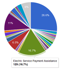
Google offers Fusion Tables, a free experimental tool that you can use to upload data from a spreadsheet and quickly create interactive charts and graphs. When users mouseover part of a pie chart, for example, the number of calls and need category will pop up. You can also create summary tables, maps, and “card” views of your data, which turns each row of a spreadsheet into an easily readable index-size card displaying the contents of each field. graph1

Perhaps the best part of this tool is the ability to create views of your data that can then be shared with others, either via a link or by providing access to specific users through their Gmail accounts. This feature allows you to share only certain fields of a spreadsheet while keeping others visible to just you. When users access a view, they can create new charts and filter the data to display what’s relevant to them without changing the layout of the original Fusion Table. This type of functionality makes data sharing much more efficient; instead of creating reports for each county in a region, for example, you can simply upload your region-wide (anonymized) call data and give your regional partners access to filter the data by county or by whatever criteria are relevant to them. Google Fusion Tables also offers a mapping feature, but for that I prefer another tool:

GeoCommons

GeoCommons is a free online mapping application that enables you to upload a spreadsheet, geocode the data, and display it on an interactive map. Since GeoCommons is also a place for sharing datasets, there are many types of data that you can layer onto your call data to add meaning. Examples of datasets that are freely available and have been uploaded to GeoCommons are: school districts, foreclosure scores, unemployment rates, census demographics, bicycle counts, legislative districts, adult ESL & GED information, profiles of older adults by state, and much more. The benefit of GeoCommons is the huge variety of datasets that have been uploaded, but this can also be a drawback because some of them are not formatted properly or may not look right when superimposed on your call data. You may have to experiment with multiple versions of the same data to find a set that works best with your map.map1

Despite the need for some tinkering to create a good map, the visual impact of the final product cannot be overstated. You can instantly see which areas in your region are generating the most calls for a specific need, and if you layer other datasets over your data, you can simultaneously display meaningful information like income level and foreclosure rates for the regions that generate high call volume. GeoCommons maps can be embedded in webpages and shared via links just like Google Fusion Table charts.

These are only a couple of the many free online tools just waiting to be discovered. The more you explore, the likelier you are to find a tool that could end up providing an ideal solution for your data-sharing needs!